Topic Contents
Writing – Architect/ Alaa Mohamed Abdel Ghani & Reviewing and Publishing – Architect / Shaima Magdy.
an introduction :
The reception hall is the place where you feel comfortable after entering the house and where you receive guests. This room includes a sitting area and can contain a dining area. It can also contain a reading library, as it is divided according to the owner’s desire and according to the area of the house.
– We had previously dealt with the living room, which can be included in the reception halls, but the living room is more private and limited to the activity of sitting, but the reception halls can include more than one activity. You can see the design of the living room and the foundations of its furnishings from Here Learn about ideas and mistakes to avoid making them Here .
With my architect’s lens today, we will know what are the considerations for designing reception halls and how to furnish them, and we will answer these questions:
What are the design considerations for the reception hall? What are the most important design rules?
What are the best colors to use for the reception hall?
– How can we distribute the lighting correctly in the hall?
What are the most important ideas for designing reception halls?
First: Design considerations for the design of the reception hall
The location of the hall is the place connected to the main entrance and it can be connected to the rest of the rooms, but it is preferable that it be separated for privacy.
The hall contains more than one activity, so it is taken into account to divide the hall into different areas for each space.
Take into account the placement of furniture so that it provides ease of movement and makes each area separate from the other.
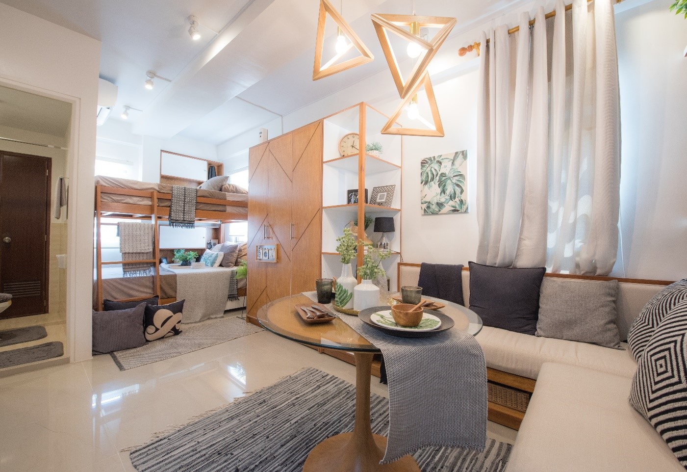
Designs showing the divisions of the reception hall with more than one activity (sitting place – lounge – dining area – watching TV)
Secondly, the design rules of the reception hall
1- The model used
Determine the model to be used (modern – classic).
modern Metal and glass are used, and they are simple and clear in shape and easy to perceive the space, and the space is more practical.
classic The furniture is made of wood, and the golden color is usually included in the design. Classic chandeliers are used, and the panels are placed on the walls, and it is intended to give a sense of luxury.
2-Choose the colors
The colors used at the beginning of the design must be determined so that the space fits together (furniture – carpets – color of walls – curtains).
3- Pieces of furniture
Making the size of the furniture pieces suitable with the size of the void is very necessary.
4- Illumination
As we said, the space is multi-use, so when designing, it is necessary to take into account the distribution of different types of lighting and to make each type on a separate switch to suit the activity.
It is preferable not to combine two different colors in the same space (white and yellow). It is better to choose only one of them.
Third: The colors used in the reception hall and their significance
Preferably use Neutral or pastel colors Inside the void in the walls, ceilings and large pieces of furniture, which gives a sense of calm and comfort.
In case you want to color input For space, it can be either (in a distinctive wall to distinguish it – in pillows and chairs – mixing different colors in the curtains – adding colors to the carpet in small inscriptions – using it in small inscriptions in wallpaper).
Best used colors Beige color It gives a sense of spaciousness and warmth to the void the colour grey .

Fourth: the finishing materials used for the reception hall
1- The walls
Wall finishing can be Paint in desired color It prefers neutral and pastel colors to give calm and sophistication – can Finishing a wall with marble If you want to distinguish the wall.
– can be used Wallpaper And take into account the appropriate selection of the size and colors of the engravings in it. Small engravings are preferred, as they give more space to the space and do not cause great waste in the installation of wallpaper together.
– can make Part of the wall is wood If it contains a specific activity and is to be identified.
2- Flooring
porcelain Where it gives a sense of luxury and sophistication to the void and is characterized by permanent luster.
ceramic Where it takes multiple shapes, colors and sizes, and some of them take the form of marble and wood as well.
the wood It gives a sense of warmth to the void and is easy to install.
epoxy Where it is poured in the desired shape for the void and covers unique shapes.
marble or granite They give distinct shapes to the void.
vinyl Which takes multiple forms such as parquet and multiple forms and can be placed on any surface and is characterized by its durability.
3- Bishop
In the absence of problems with the ceiling, the ceiling is covered with paint and a suspended ceiling is made to put the spots.
In the case of suspended ceilings, there are several types:
– wooden ceilings:Attached to extensions and mirrors and gives a sense of warmth to the void.
– Gypsum ceilings:It is the most widespread and is suspended from the ceiling and lighting units are placed in it.
– glass ceilings: It gives a beautiful shape, but it must be installed accurately.
It is possible to combine more than one type in the same ceiling and on different levels.
Fifth: The elements of the furniture for the reception hall and their distribution
Frames:
When placing the frames on top of the sofa, it is preferable to leave 10 cm above the sofa.
And the width of the frame is preferably two-thirds of the width of the sofa, whether it is one large frame or several small frames.
carpet:
It is preferable to have large carpets that define the seating area, and each area has a separate carpet to separate the backward areas, for example:
Sofa seating area At least the legs of the sofa should be placed on the carpet to contain the space.
Curtains :
It is the entire width of the wall, so it will be more beautiful and warm to the void.
Sofa and chairs:
It is placed in the form of the letter U or L until it is given space containment.
the tables :
Put a large table in the middle, but put small tables that can be moved to meet the needs.
the plants :
It is preferable to be placed in untapped corners, as it gives a connection to nature.
pillows:
The colors of the pillows are diversified in order to create a different sense of space. It is preferable that the colors of the pillows match the colors of the carpet so that there is consistency in the space.
chandeliers:
In the case of placing it in the middle of the space, we calculate its diameter by adding the two sides of the hall and dividing the result by 12, and thus we get the appropriate diameter of the chandelier to suit the size of the space .D = (a+b)/12
Wheelchairs or wheelchairs:
Chairs or couches are used in case the number of people exceeds the sofas in the hall.
Or used to close the sitting area instead of the sofa, which is characterized by ease of movement.
Sixthly :Dimensions needed for some elements of the parlour
1- Hanging Lighting Units
When we put it above the table, we take into account that the distance between the lighting unit and the end table is at least 30 cm.

2- the sofa
Its height from the floor does not exceed 45 cm before placing the upholstered part so that the sofa becomes comfortable.
The depth of the sofa is not more than 50 cm to make sitting better, but if the depth is increased, pillows can be placed at the back to reduce it.

3- Table :
It is preferable that the distance between the sofa and the table not exceed 90 cm, so that it is easier for individuals to cross and so that it is easy to take coffee from the table.

Seventh:Lighting and its distribution methods
It is divided according to usage below, for example:
Hidden LED lighting in suspended ceilings to create dim lighting.
Hidden lighting under the shelves to make the space quiet.
Hanging lighting to focus on a specific item.
Spotlighting on the table.
Side lighting next to the sofa (bathbags).
Diversity in types of lighting serves to create more than one feeling within the space and to suit all uses, and each type of lighting must be separated on a separate switch for easy control.
Different design ideas for the reception hall:
First design:
Diversity of seats to suit several uses.
Use separate chairs to close the void and be easy to move as needed.
– Introducing colors in the pillows for diversity.
Divide the large table into small tables for easy movement.
– The seating area is closed and demarcated from the rest of the hall and the way to enter it is specific and clear.
Use the rug the size of the area to increase its definition.
The use of calm neutral colors gives beauty to the hall.
Second design:
Choosing pastel colors for the space gives a sense of relaxation.
Marking the area with the carpet.
– Use the frame above the sofa, its width is two-thirds of the width of the sofa and its height from the sofa is appropriate.
– Using the side lighting in the corner to exploit the space and to use the light source in the case of reading.
Use an easy-to-move side chair to suit needs.
Third design:
Choosing colors that are harmonious together and characterized by calm.
– Make the sofa on the letter L to contain the sitting area.
The use of plants inside the hall gives a sense of nature.
There is more than one natural light source.
Make the table divided into tables that can be assembled easily to serve more space.
Use a side lighting source for reading or to create calm.
Fourth design:
– Introducing a different color, which is blue, and merging it in more than one element between the frame, cushions and carpets
Create harmony in the space with the gradation of colors between white, gray and blue in its degrees.
– Combine colors in an attractive, comfortable and varied way without exaggeration.
Fifth design:
– Using a modern style, where metal and glass are used.
Mixing fabrics using plain and patterned fabrics and repeating them in pillows gives a sense of merging space.
Use simple colors that are easy to perceive.
– Make the sitting area on the letter U to make it closed.
Availability of natural lighting.
Eighth: An example analysis of a reception hall

•Style: It combines the modern and the classic, where the sofa and the table are used in a modern style, but the bathtubs are in classic steel.
•Colors : The combination of beige, gray and white gives a sense of spaciousness, warmth and sobriety.
•lighting: Introducing natural lighting from the window so that it is made across the wall to make the most of the natural lighting. Putting hidden lighting in the suspended ceiling.
Putting the spots directed on the bathtubs to focus on the frames to be placed inside the bathtubs.
•the plants : Put it in the corner where it is not exploited and thus we exploit it with plants that give a sense of nature.
•a couch : Two types of fabrics, plain and embossed, combine with small patterns that take the same color as the pillows to connect the elements. Putting the sofa on the letter L to contain the space, and you can put the pillows to close it more.
•pillows: It takes the color of the curtain and the color of the sofa patterns, and it can be used if the depth of the sofa is increased to sit comfortably.
•carpet: You include the sitting area.
•curtain: The width of the wall to give a sense of space, sophistication and luxury, and the combination of white and beige colors used in the space.
•Puffs: Used to increase sitting places and ease of movement.
•Roof : Use the suspended ceiling of gypsum to place the lighting units.
•floor: From wood, which gives warmth to the void.
•the wall : White paint and beige bathtubs.
Sources:
1- Living rooms – 5 basic rules that you must follow and take care of when designing living rooms
2- The subtleties of creating a harmonious interior design.
3- The best colors for the living room.
4- Types of finishing materials
Executive Designs, Faculty of Engineering, Port Said University
5- Basic rules when choosing the right size of furniture for the space of each room.


