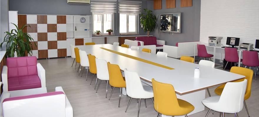
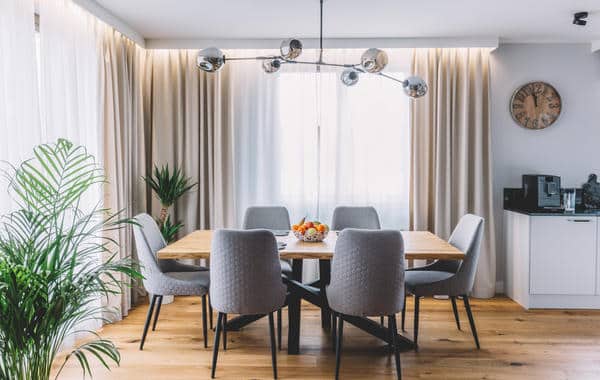
A school staffroom is the place in which teachers and the school stuff spend the majority of their non-working time. In this article, i am going to explain the principles that I used when I re-designed a school staffroom, Incirlik Ahmet Hamdi Tanpınar Middle School — Turkey/istanbul
From my beliefs that’s a staffroom is important for improving staff wellbeing, and building a sense of community and connectedness.
1) Understand the brief of renovation the school staffroom
The designer must get inside the heads of the people to understand their needs, and why they are after it. Understanding these ideas gives flexibility and makes the designer work easier.
2) Understand existing conditions for the school staffroom or any place generally
The great advantage of renovation is that the existing place has a history and you won’t start from zero so i always try to find out all I can.
The staff, management and other people can have a wealth of information so make sure to listen to their ideas carefully
Is the place too cold or too hot? What do they love about the existing place and what they don’t love? Is there is any renovations have been done over time?
3) Understand the structure of the place
Where are the Columns? Is the situation of the floor ok? Are there cracks and why? Where do the services run?


The principles
Creation is always a Flexible process. There are no fixed ‘rules’, for the principles to be followed and to be weighed as appropriate to the needs of the job and the client.
For me always these following principles should be considered even if I can’t use all of it, because not every principle can be applied in every job but I try to use most of it.
Create beauty: An ugly place will not last long, and it will be changed in a short period of time, i always try to take my time to make my solution artful — if not a work of art. I try to adapt according of the project deadline that I have.
Color Psychology: in this project I tried to mix between Warm and Cool color, converting the old boring colors, to make the space more cheerful and optimistic, for sitting area I used gray: which refer to conservative, formality, also for the computer working area I used white color which increase the focus of working, for kitchen space I used orange color depending on theory of Color Psychology in Food Marketing, which says: If you like to eat and you want to enjoy your meal with no limitations, go for yellow or orange.
Keep existing structure as much as possible: i don’t try remove everything but i remove as necessary as to fulfil the work.
Re-use and recycle the materials: There is nothing better than parts of the place that carry stories, think about the memories that can give a place soul and history, on the other hand keep using some of the good materials — turkish furniture — can save in the project budget, for example in this project we didn’t change the materials of the windows or doors and we just painted them.


تابعنا